Most of Claude Monet's creations are indeed created with colour in mind and that is what really emphasizes the amount of potential for imagination.
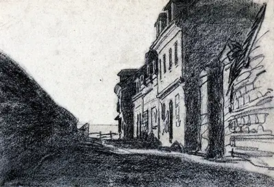
Monet often features a classical semi-vibrant vibe with a lot of blue and water, while Houses By The Sea looks very bland in comparison. Black and white often means old and/or boring, but these homes off of the ocean are unique to Monet, and that is interesting.
Emotion - It’s oddly curious why this picture is in black and white. Was it rushed, or was there planning and thought beforehand? Perhaps it’s because Monet was sad, or even getting over an event like a death of a friend. He could have even been inspired by something positive.
Imagination - The imagery is subtle, yet inconsistent. It’s hard to get a good read on Monet’s thought process. Rushed lines at the top of the short brick wall and a large sloppy line on the left pole. But rather neat and orderly straight edges near the north of the image. That is why this picture has so much to offer. Because it truly doesn’t.
Unique To Claude Monet - Dozens of his pieces feature a large area of water with light, soft and inoffensive colours. On the other hand he seems to have loved doing rough sketches with no to low colour. Another questionable choice that was made with Houses By The Sea is that he didn’t do much low-level shading. He went for a stubborn looking, tough street corner, with solid lines and lots of definition. Created in 1864, could this have been a previous warzone? Did this creation impact Monet’s decision to make the famous Impression, soleil levant?
Consistency - Looking at the left of the image, and then to the right, there is a vast difference in line technique. Monet went for a very solid and smooth left blend to draw what looks like a brick wall off of the sea. But then take a look directly opposite to the right. No blend, no patience, just simply rough and raw curvy lines. Is that bad? No. It is however interesting considering Monet’s previous drawings and post Houses By The Sea.
Comparison - We’re going to be taking another look at Monet’s painting “Haystacks”. Haystacks is best described as a few basic blurs of warm colours. Whereas these buildings near the water showcase a bland, smudge-less image with different lineage. Limited definition in Haystacks, while Houses By The Sea offers almost 90% more definition.
Conclusion - It’s extremely hard to get a perfectly accurate read on these houses that Monet decided were worth sketching. Monet is an interesting artist, and often shows precisely defined emotion in his creations. However these houses are definitely frowning, with a similar mood to Van Gogh's Potato Eaters.